Reimagining Design Systems at The Met
A cross collaborative group of designers, product owners and engineers wanted to create a design system that allowed us to build faster, reduce design debt, eliminate siloed and duplicative development and empower editors to produce content independently.
For our audience this meant a more consistent and compelling experience throughout our online and onsite experience. For us it meant we can build, measure, learn and innovate faster and more frequently. Pulling off such a large, multi-property and multi-platform effort is hard and risky, but it delivers longterm benefits for all.
Where we started
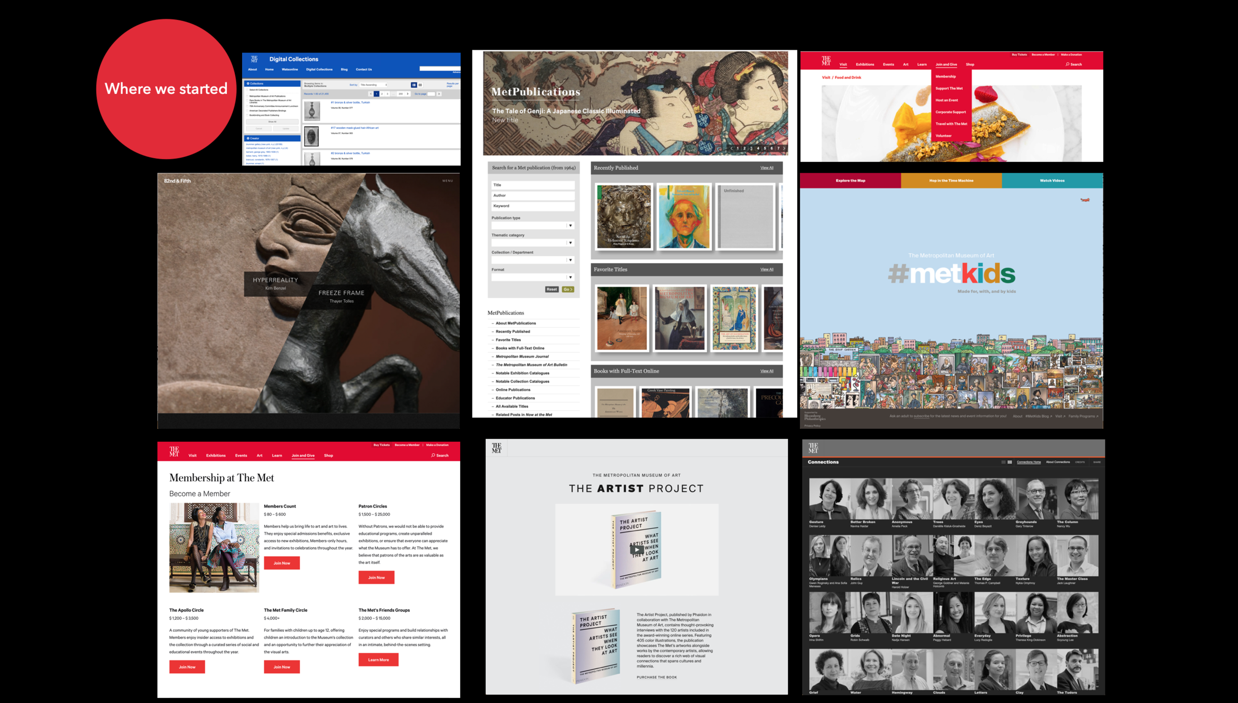
Before we started, all of The Met’s digital experiences had their own product strategy, visual design, user experience, technology stack, and editorial tools. We were often doing things three different ways and we were unable to quickly apply what we learned on one site to another. Our editors, designers and engineers could not cross brand boundaries. And perhaps most importantly, our audience could not traverse our website effectively. In short, nothing scaled.
We created a holistic product strategy for the Design System. The goal: unify the digital experience enabled by a shared technology platform and pattern library that would allow us to innovate faster and grow more effectively.
Unified visual experience across channels
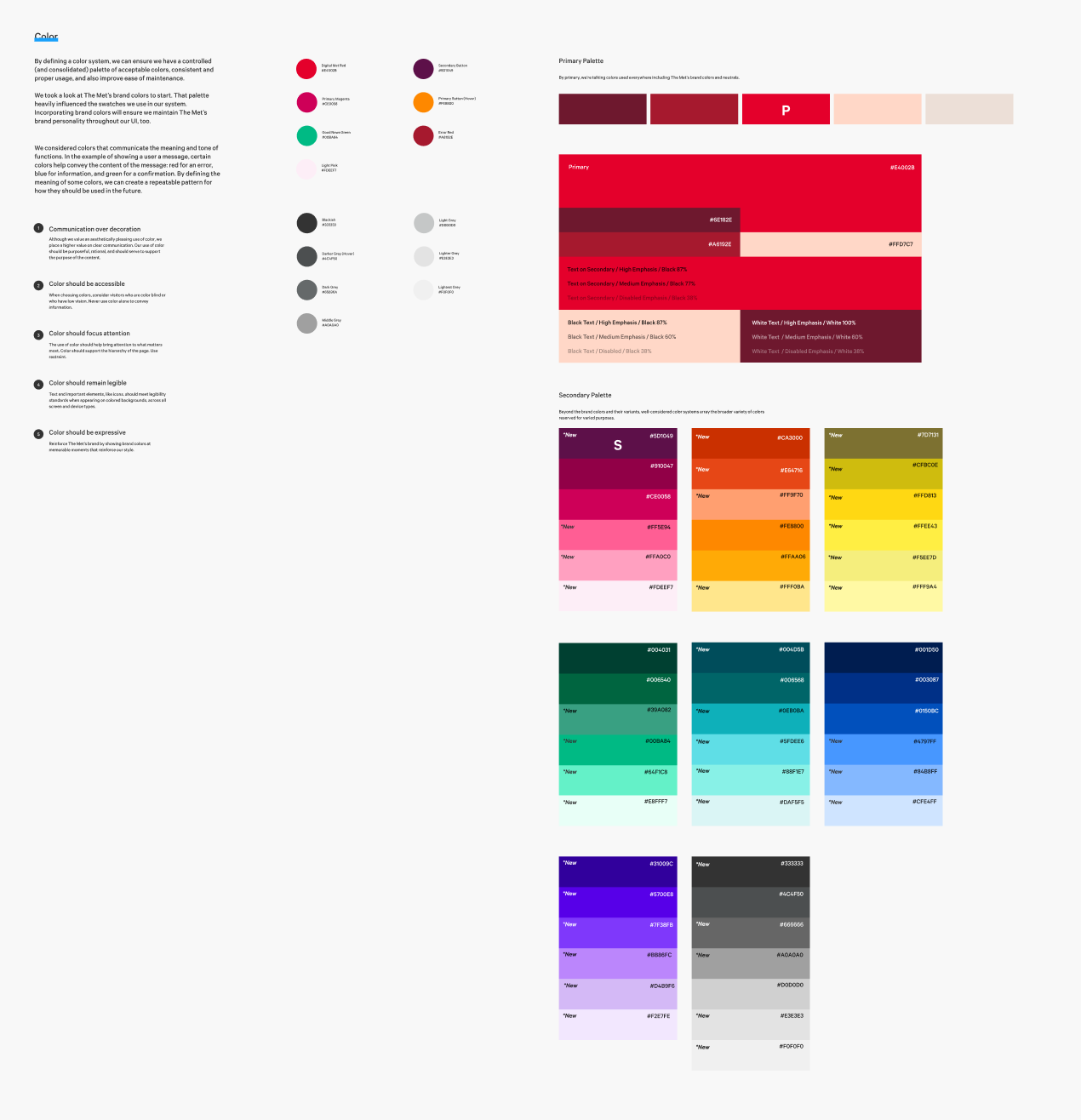
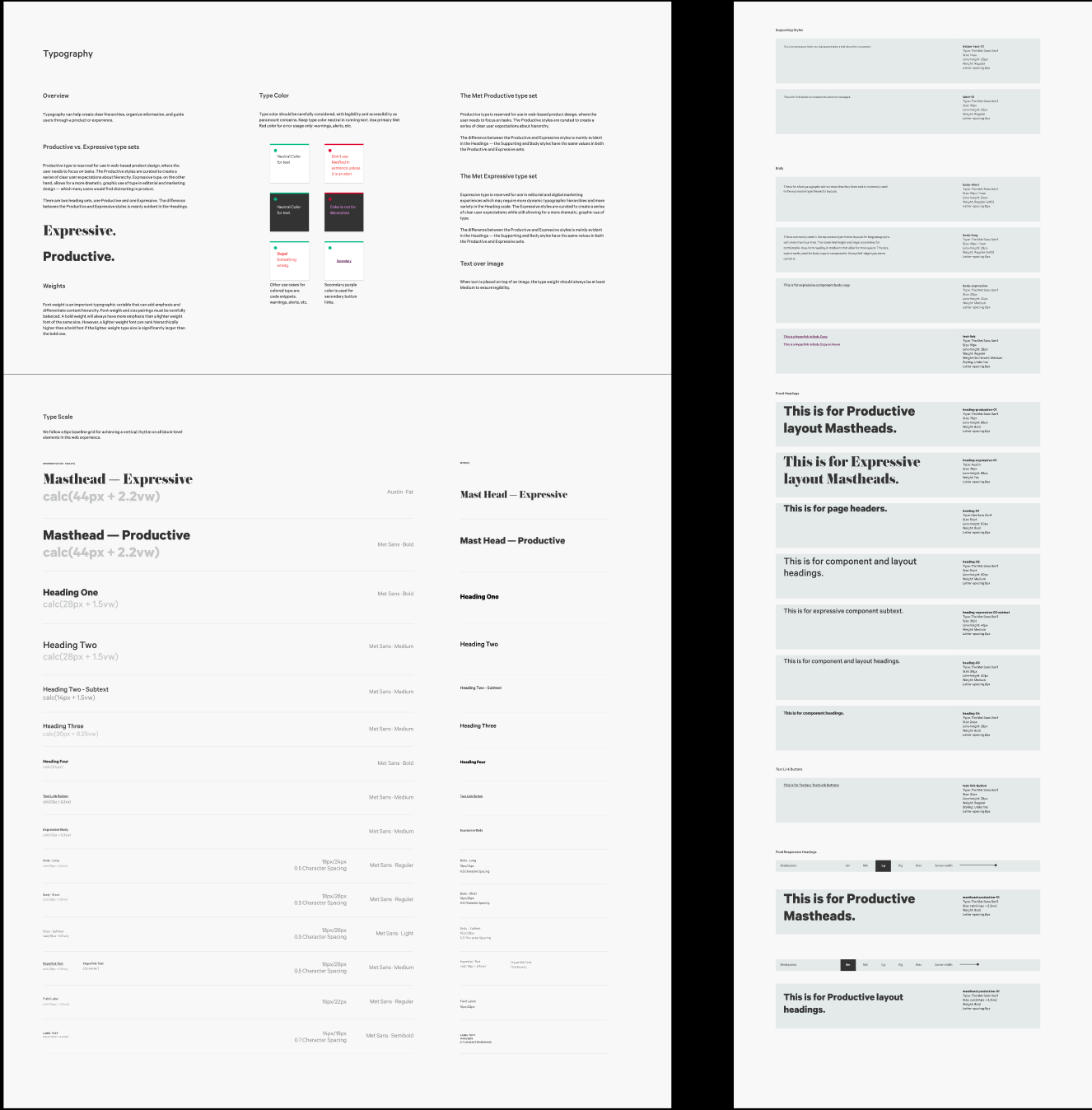
One of the initiatives I led was to unify The Met’s visual language with brand language. When The Met’s website was first redesigned in 2015, there was a brand strategy implemented along with the brand redesign, but with multiple iterations and no product design oversight, there was/and is immense visual fracturing through the online experience. As a started goal, I wanted to unify the typefaces used across products and marketing and begin the foundation of a Design System.
Design System principles
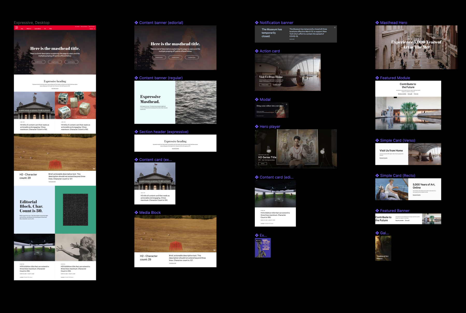
Principles are used to facilitate day-to-day decision making. We created a scorecard with the principles to make them easier to use and for the designers to align their thinking and design process to.
Rational
Based on real-world situations. Every component, pattern, and principle is informed by research and thoughtful testing.
Human
Places user needs first. It's deeply committed to a high standard of accessibility, honesty, and respect for user attention.
Flexible and sustainable
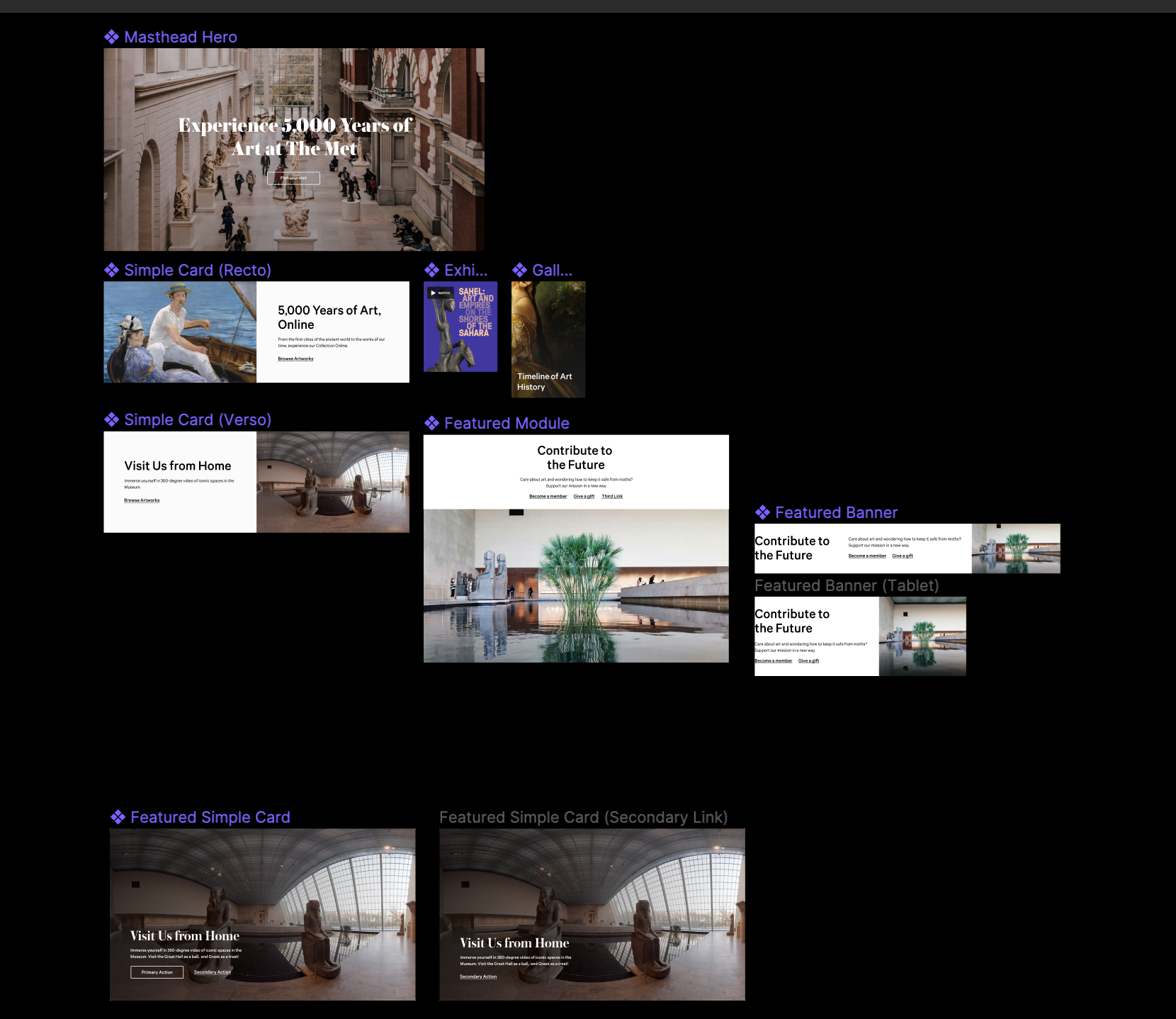
Components are flexible to exist in multiple ecosystems without breaking the environment they're in. Design patterns and interactions are created with evolution in mind.
Definitions and accessibility
System thinking
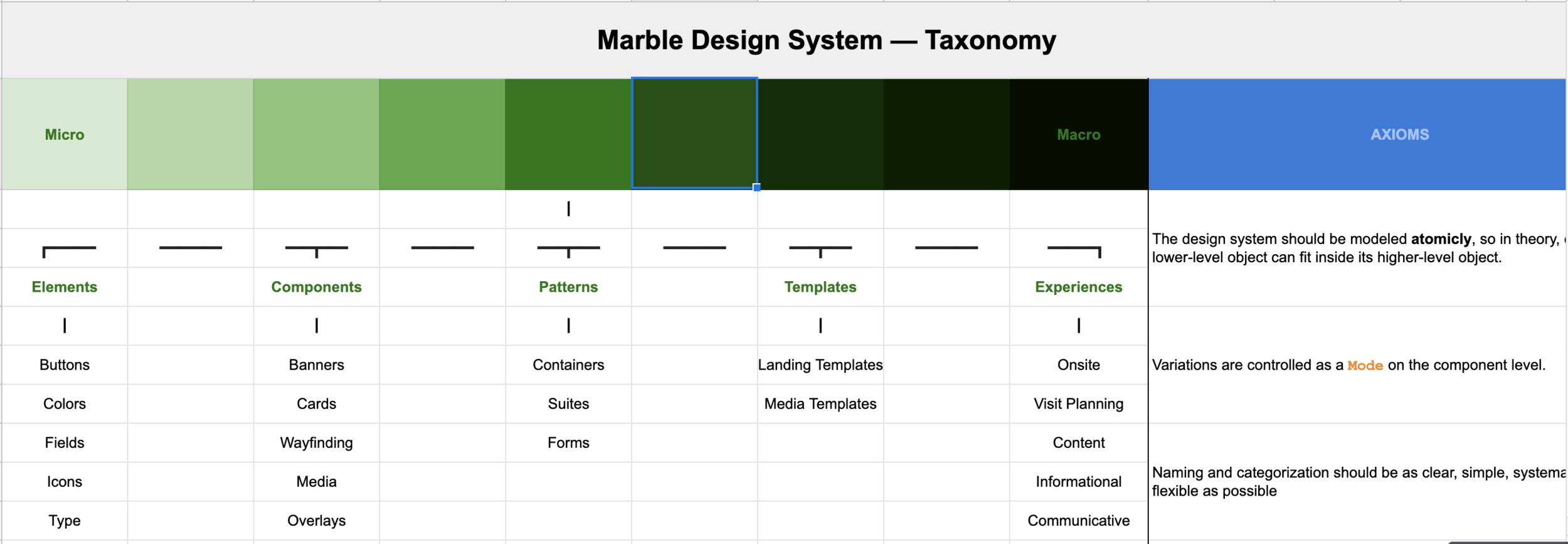
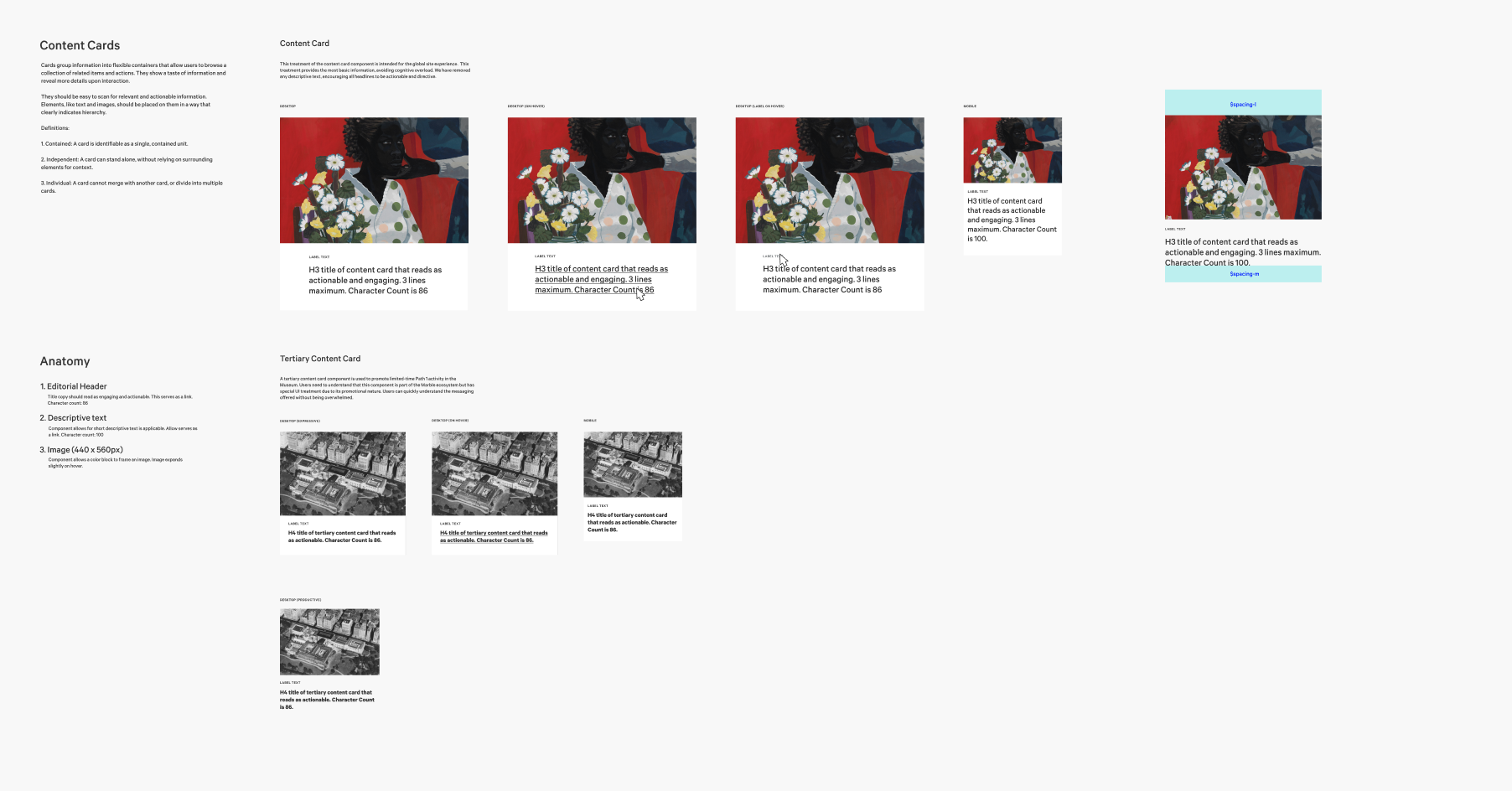
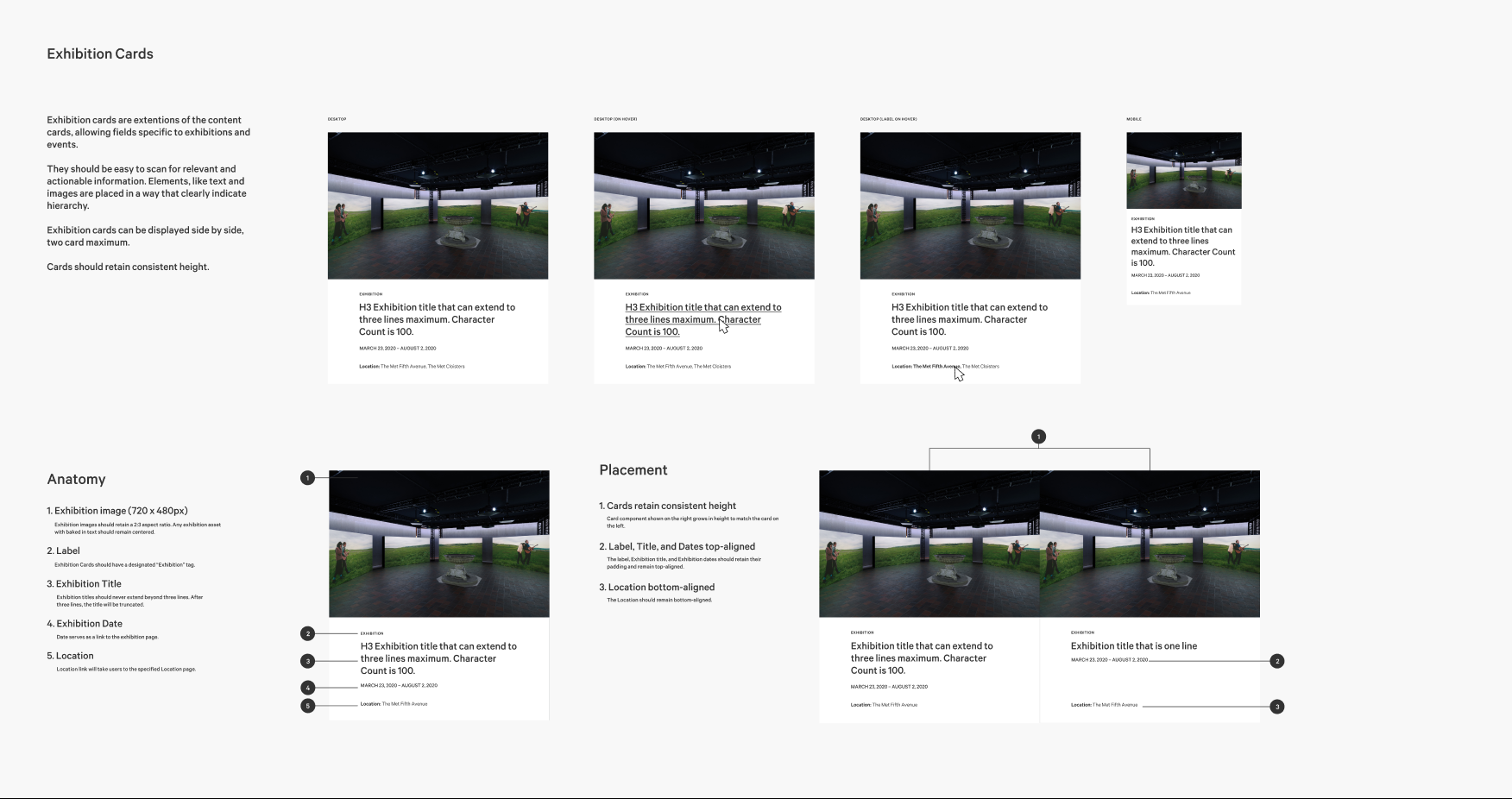
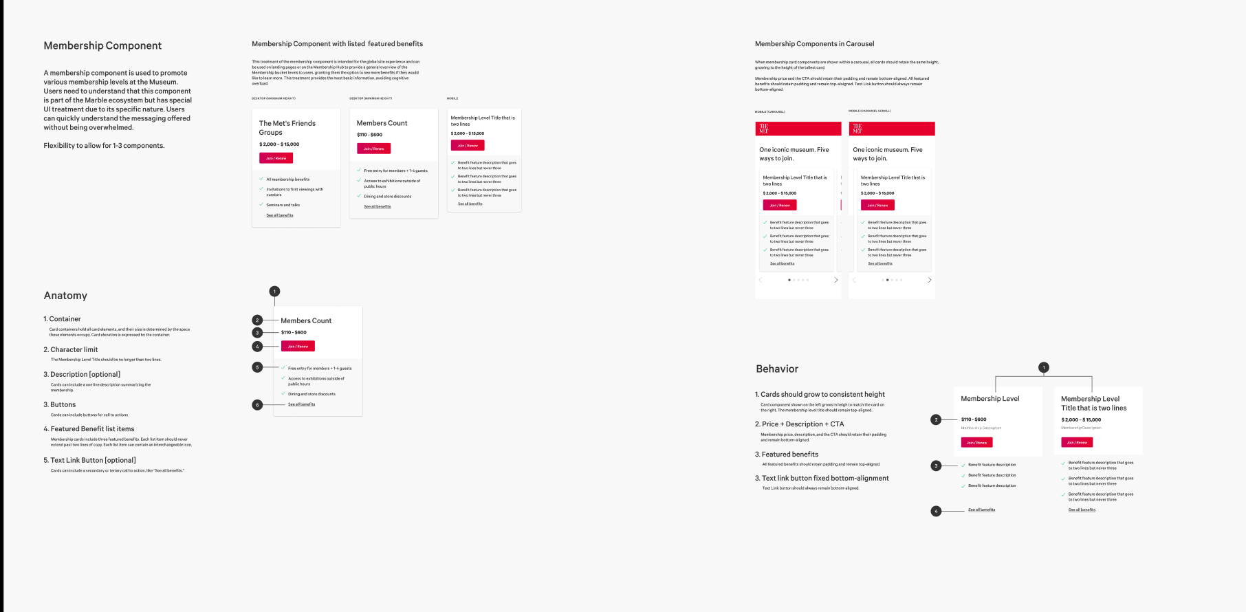
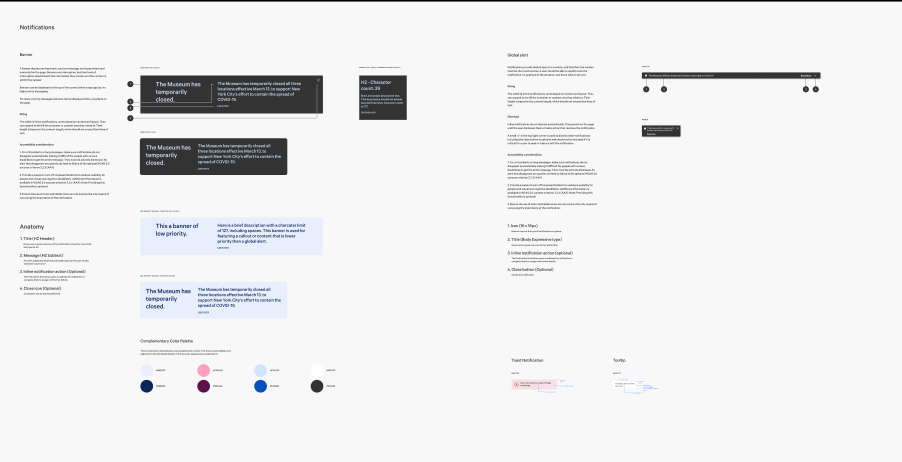
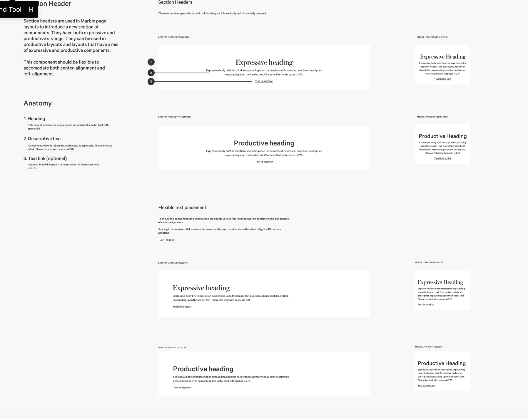
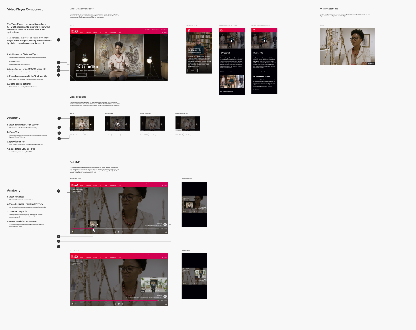
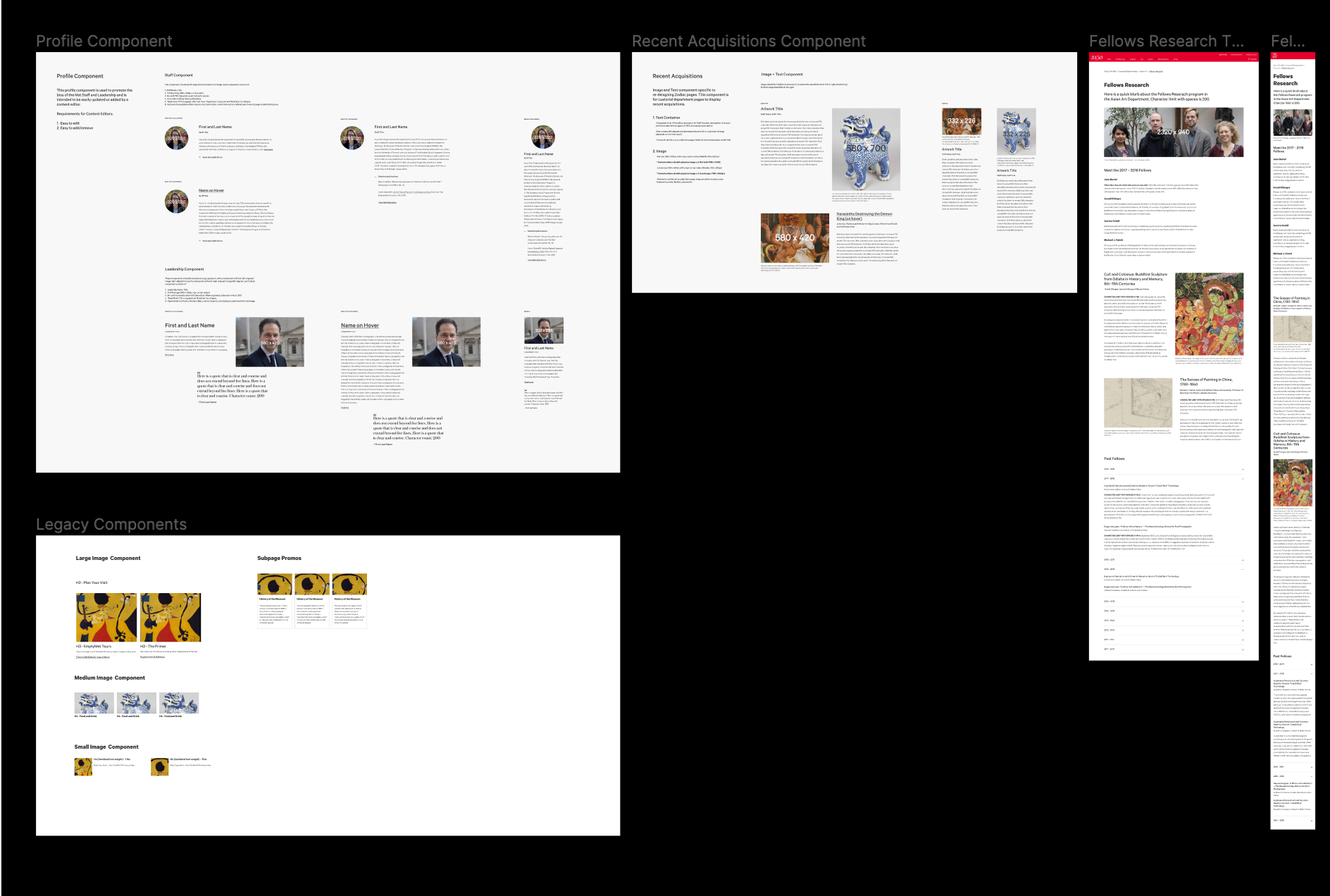
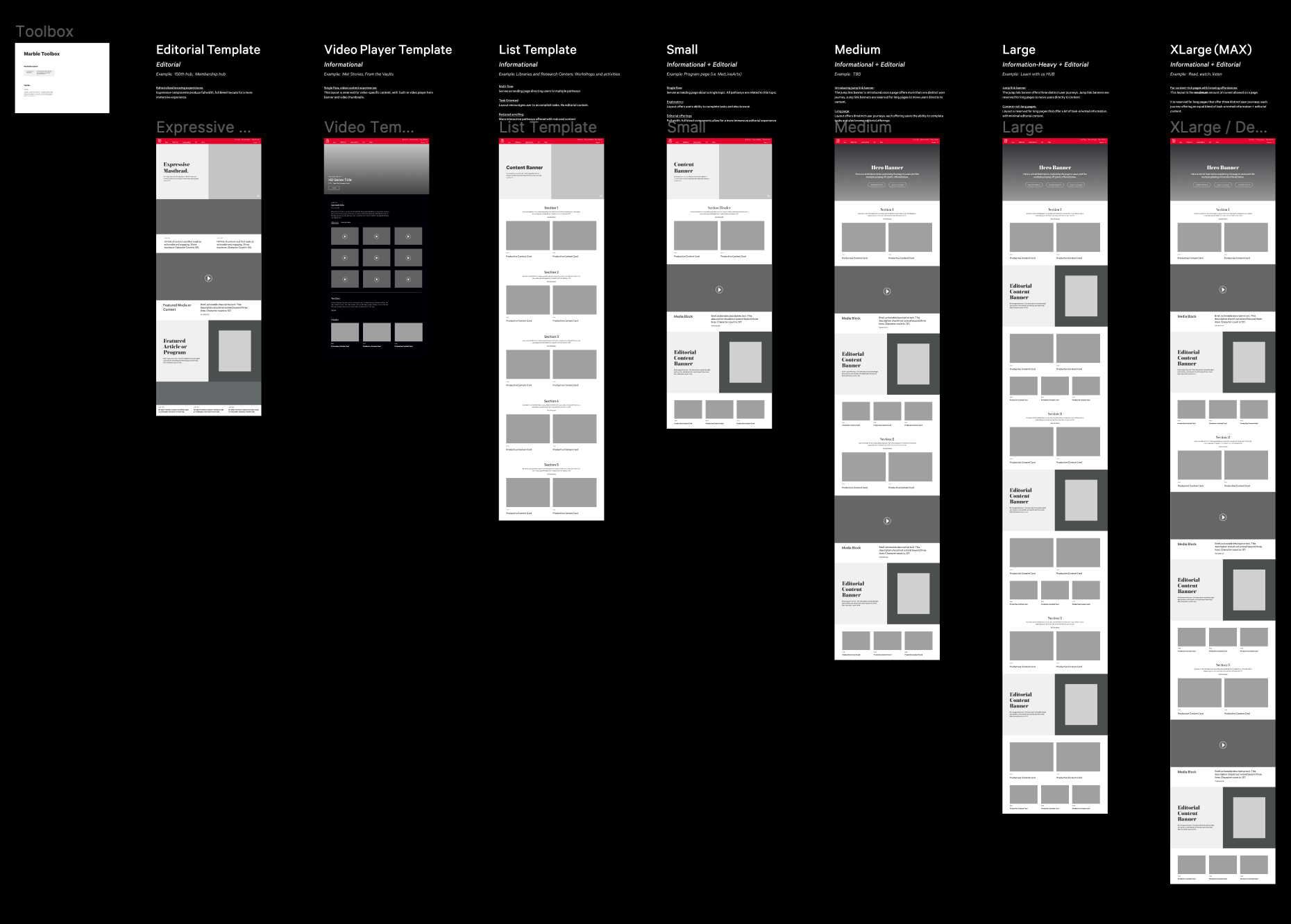
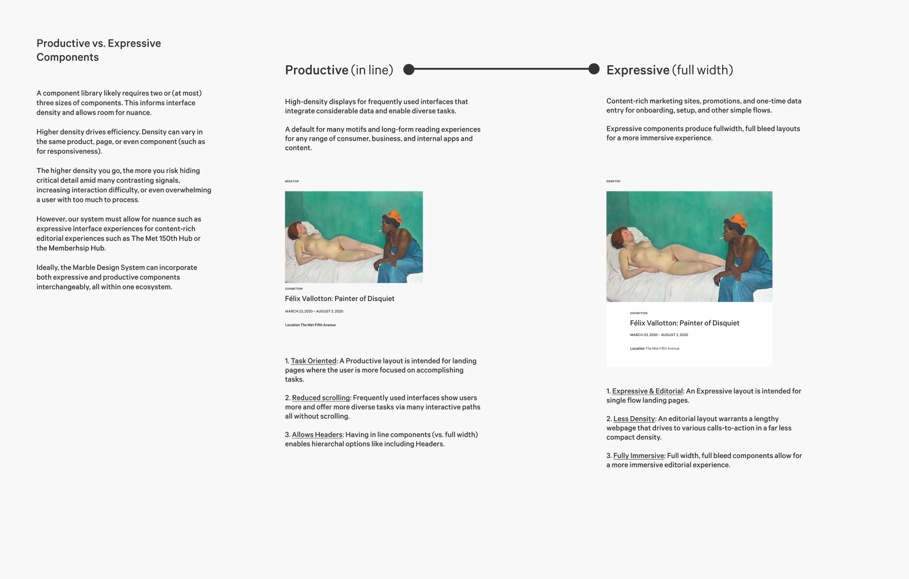
We took the atomic design route and defined the system as an overarching library of experience design and development resources.
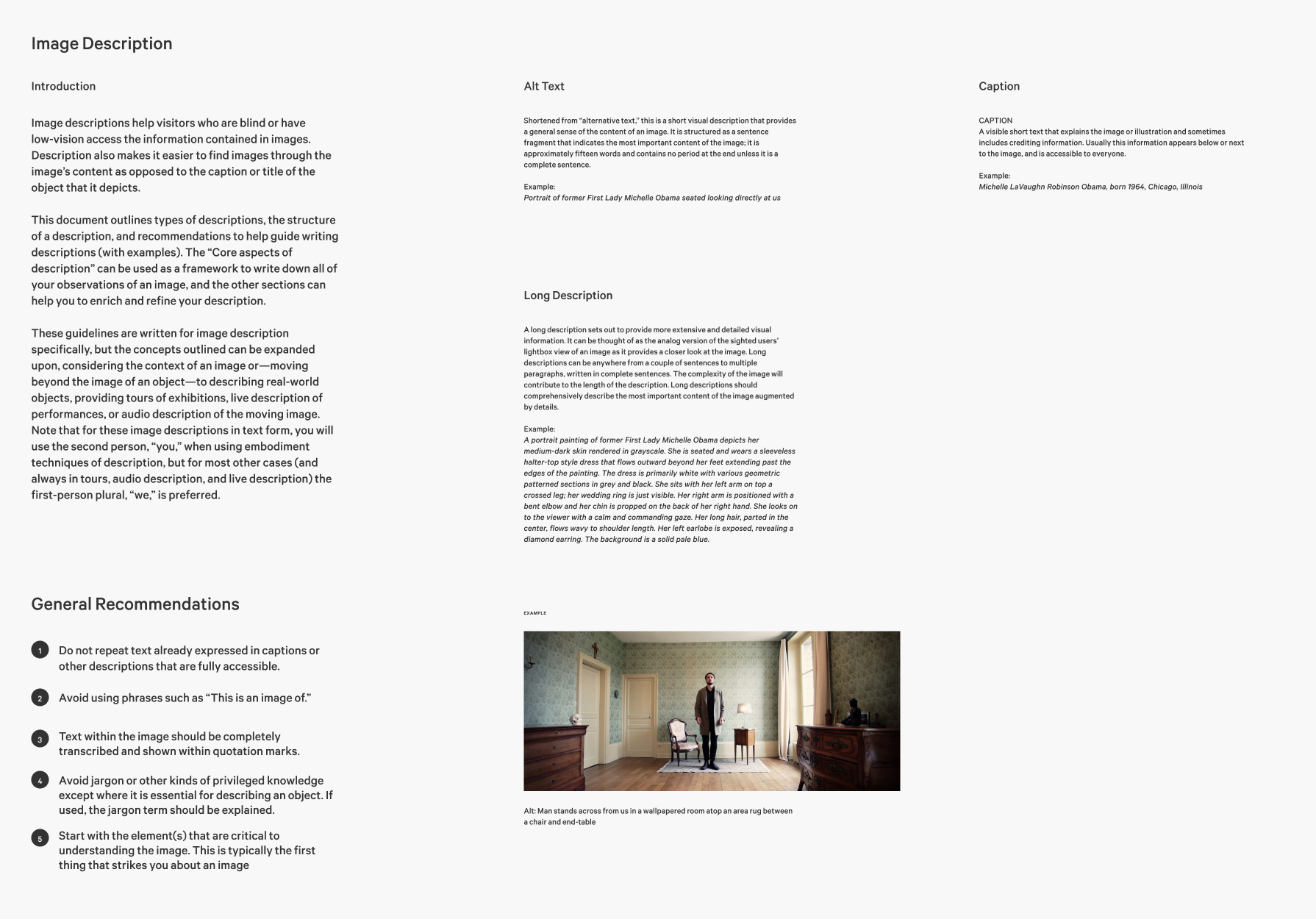
Baseline accessibility
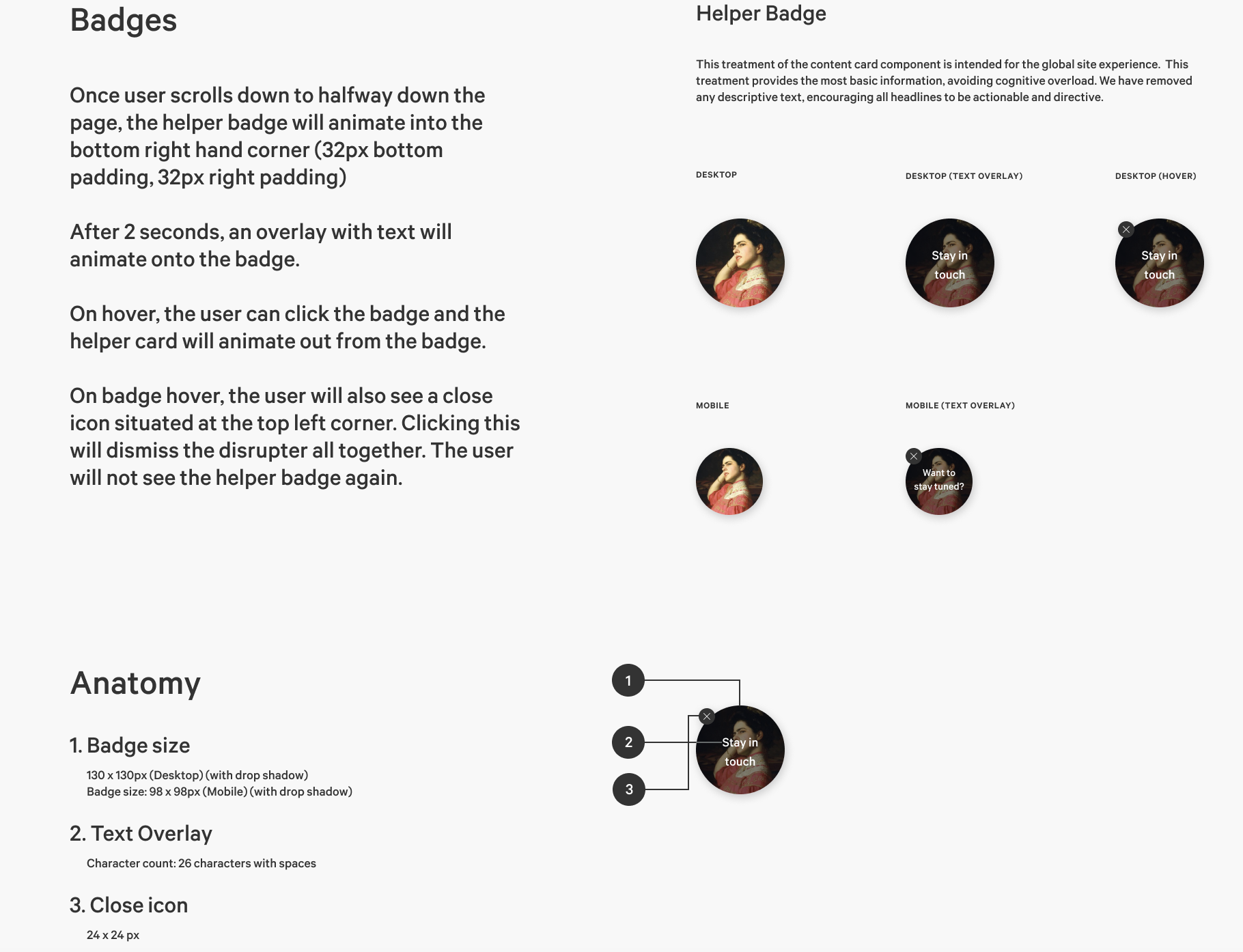
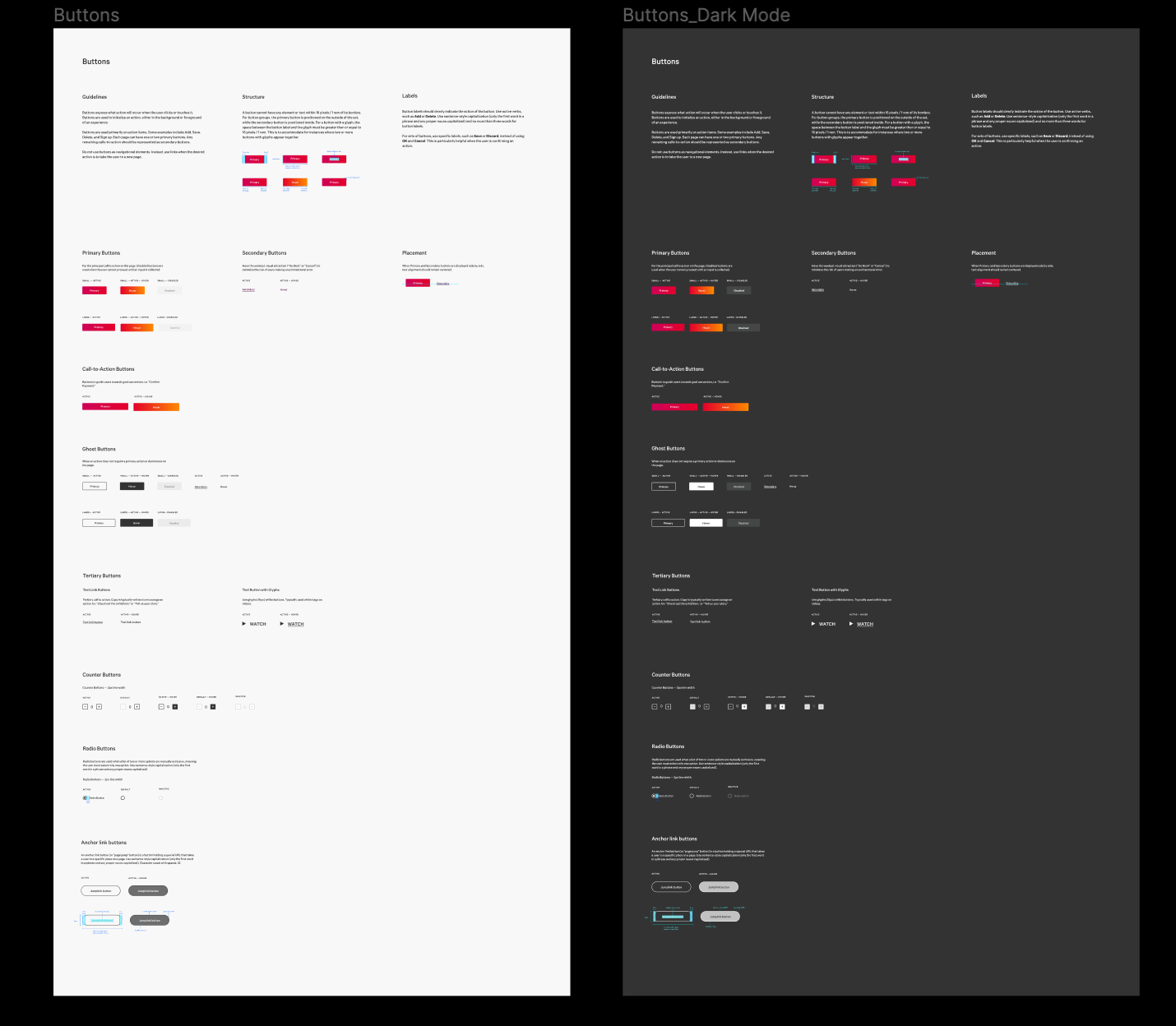
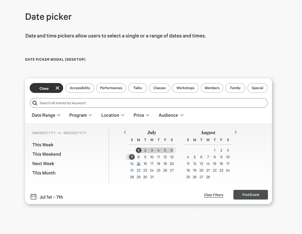
Each piece of UI that’s meant to be interacted with has defined states for both mouse interaction and keyboard interaction.
Typography
Increased information density while maintaining legibility because many of the users who need our services the most are on low-cost, older hardware and low-density screens.
Sustainability milestones
Sustainability of rhythmic and efficient delivery of software requires taking time for restoring/refreshing code, technology and design systems, tool upgrades.
Design system governance body
A group of designers, engineers and product owners which helps to maintain the system and decides which new patterns make it in.
Designers role
The process of building experiences is about a lot more than assembly, and the designers looked beyond components to usability, task flow, and how the interactions are driving users towards success.
How we implemented
Collaborate
This Herculean effort was only possible through cross functional collaboration between our designers, engineers and content editors. We created a Design Systems team with its own product goals and metrics of success to ensure implementation across all of our products.
Design with care, validate with data
Once we set a new baseline, we can measure success and iterate on the new creation. Throughout the redesign we did multiple user tests with high-fidelity prototypes and real content.
Deploy incrementally
We implemented slowly and measured each KPI’s as we made changes. This means we can monitor user behavior, performance, and segment editorial content. With each step we optimized and then scaled further.
Measuring success
Our overall goal is differentiation to drive loyalty and engagement in a space where user attention is slim. The most impactful improvement has been the time spent on our site with continuous engagement through the user journey.
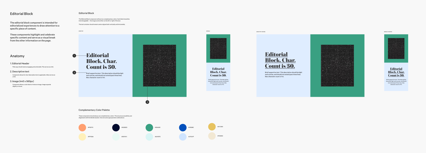
Editorial flexibility
Probably the biggest change overall has been empowering our editorial team with better tools. They can now independently create content without design oversight while still maintaining effective UX.


