Measuring the impact of design
Rethinking how to fulfill The Met’s mission online was not about visual redesign of The Met’s website, but establishing and tracking goals with experimentation.
My goal in developing the Product Design team was to quantify the value of design to the larger organization through experimentation. Designers create experiments that measure desirability and viability. They also understand that experimentation leads to active learning and the establishment of trust with their colleagues, and ultimately lead to successful designs.
While the overall purpose of each experiment is to validate whether or not a solution is viable, the purpose of testing different approaches is to validate the degree of viability in relation to desirability goals.
All of the rethought experiences that we tackled came first from observing our data points, creating measurable goals and experimenting until we achieved a desired outcome. Everything is always a work in progress.
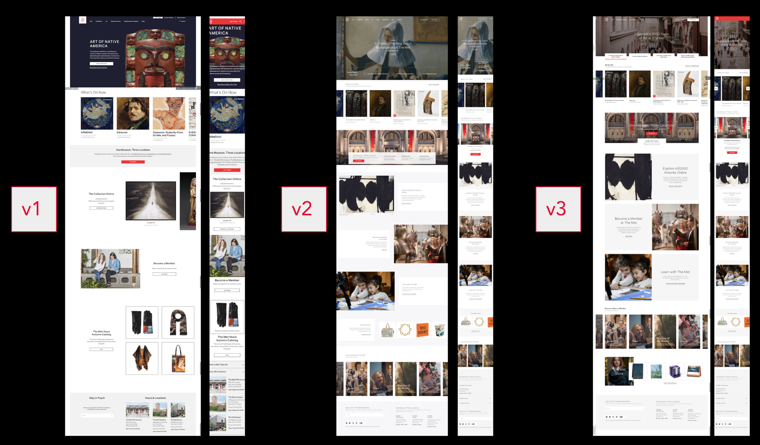
Redesigning the homepage for 4.5M+ visitors
The Met’s homepage is the most visited page on the website. it’s the entry-point for most visit planners and acts as a facilitator of visit planning. We wanted to an experience that helps our users prepare for their visit with better opportunities for discovery and engagement.
Our KPI’s were increasing the user satisfaction score, increasing visits to the tickets page and a decreased bounce rate. We A/B tested current vs. new page (90%/10%) traffic to monitor user behavior and ensure our KPI’s were being met.
1790+ minutes of listening
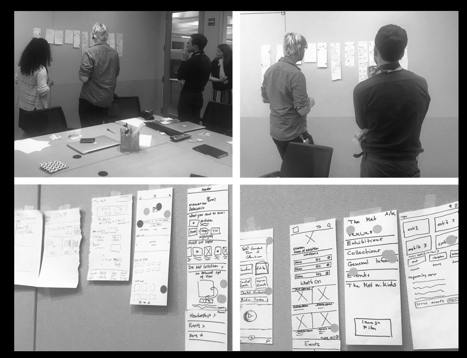
We set out to learn what our users needed from the homepage that aligned with our Goals. We used our learnings to drive our work of creating an experience that both served The Met’s mission and engaged our audience.
Building off our strength
One thing was clear: the experience should be welcoming and accessible, reaching and connecting The Met with a global audience.

What we learned
The satisfaction score increased from 5.45 to 6.5 from of user testing and interviews. Pages per session decreased, showing users were able to find information directly in the homepage. Tickets page visits increased, as users had multiple opportunities to buy tickets through the homepage.
Increasing conversion for Membership online
When I first joined The Met, the Membership transactional experience existed functionally while the experience mimicked the print design without any UX guidance or strategy. As we were seeing an increase in online transactions, we wanted to capitalize on the new traffic and create a design that converted users to a higher level. We wanted to ensure existing and prospective members could easily find the level of Membership best for them.
As an initial discovery, we conducted focus groups with existing and prospective members to better understand their goals online.
Audience driven design
We tailored the PDP design based on the audience group. Members and Patrons have contrasting needs and goals - Members looking for price value and Matrons looking to see the impact of their contribution.
A/B testing UI features
We also tested different UI treatments for cross entry points between the two audiences to see if it drove users to move up a price level but because of the drastic price contributions, users did not convert.
How did we do?
We saw an increase in conversion and average order value for both experiences. We also saw satisfaction score increase from user testing online and in person as well as using heat maps to understand interactions with the forms.
Improving the ticketing experience
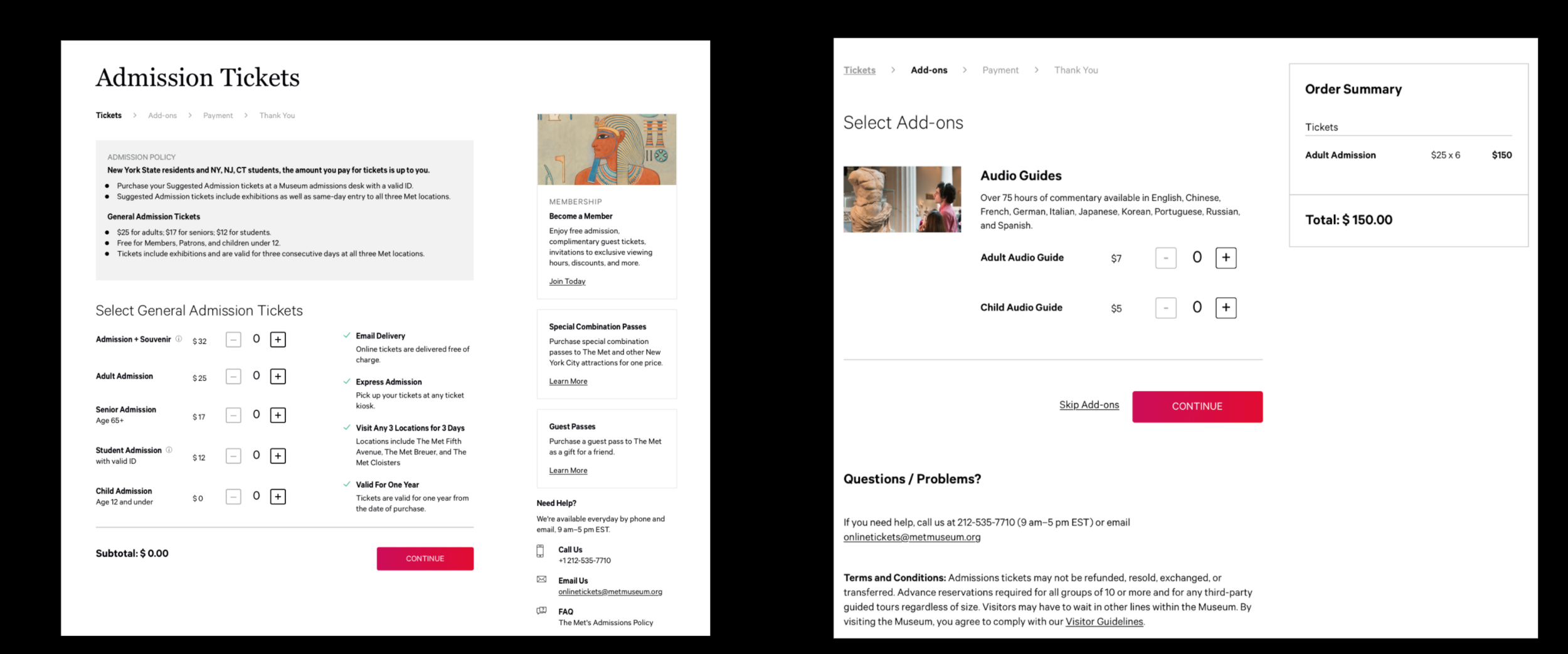
The online ticketing experience was in a similar state where it was functionally possible to purchase tickets but there was no UX strategy to facilitate the path to purchase and create new opportunities for increased revenue.
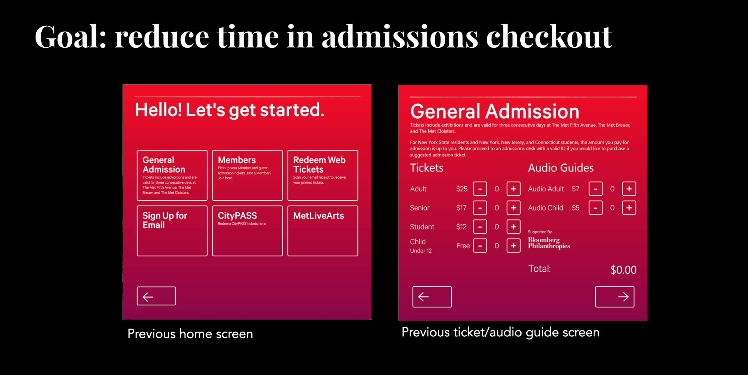
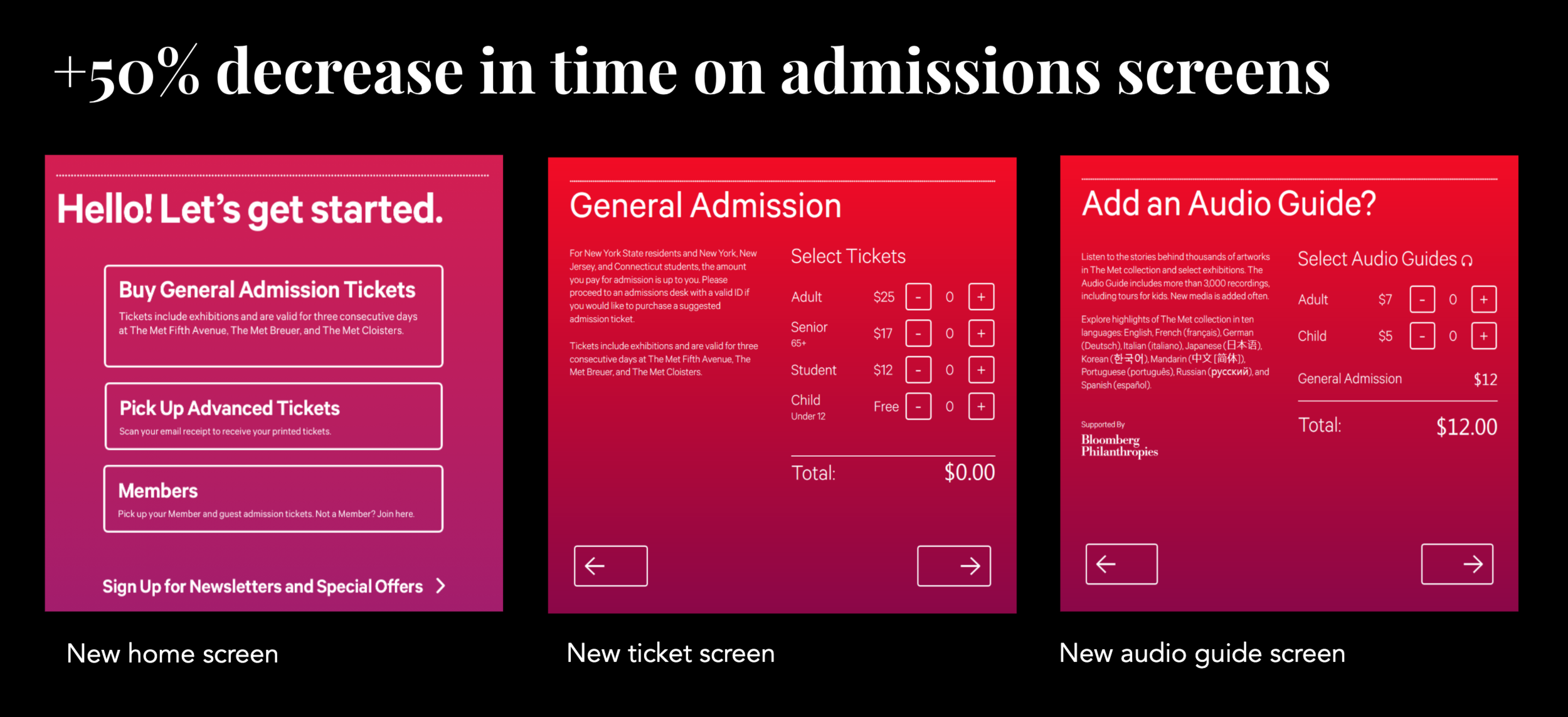
To create alignment between the online and onsite experience, we improved both the online ticketing PDP and the museum kiosk ticketing experience.
New revenue opportunities
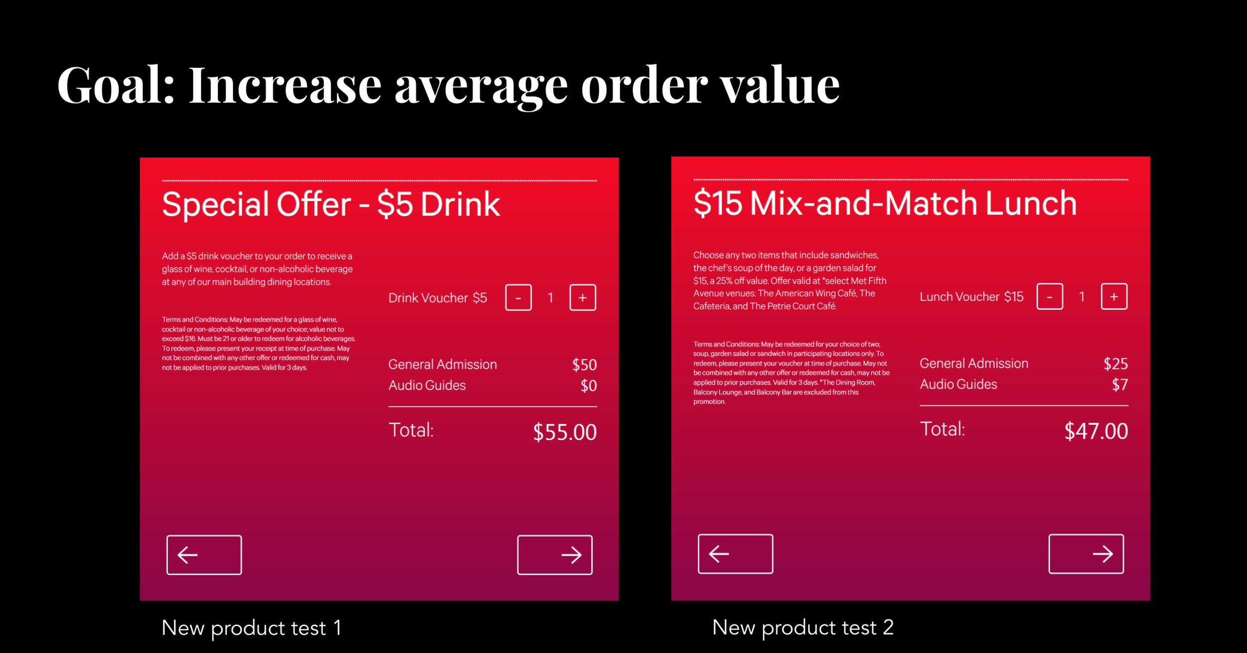
In addition to tickets, we created an add-ons experience to increase average order value.
How did we do?
We saw Increased web admissions revenue by 10% and add-on revenue by 20%.
By aligning the online and onsite experience, we saw a 50% decrease in time spent at the kiosks for the onsite experience.
Increasing engagement with intentionally calm interfaces.
We can no longer design technology the same way we did it for desktop computers. We need to think about how to design for the next 50 billion devices but also as a concept. What problem are you solving?
In thinking about intent and getting users to engage, the trend has always been to ask for their attention loudly and with disruption. Certainly, these patterns can be successful at immediate conversion but at what cost to the UX and user loyalty? In a sea of experiences asking for our attention, how can we avoid dark patterns and allow users to engage meaningfully?
Continuous partial attention
It allows people to shift from superficially concentrating on a lot of information to focusing on highly relevant information during a short attention span. Experiences should not compete with the environment to get your attention, instead they should integrate with users’ surroundings and allow for choice of behavior.
Conversational design
As humans share stories, ideas and engage through conversation, experiences and interfaces should replicate the engagement. Designing interfaces and experiences should be participatory and actions should reflect multiple audiences and perspectives.
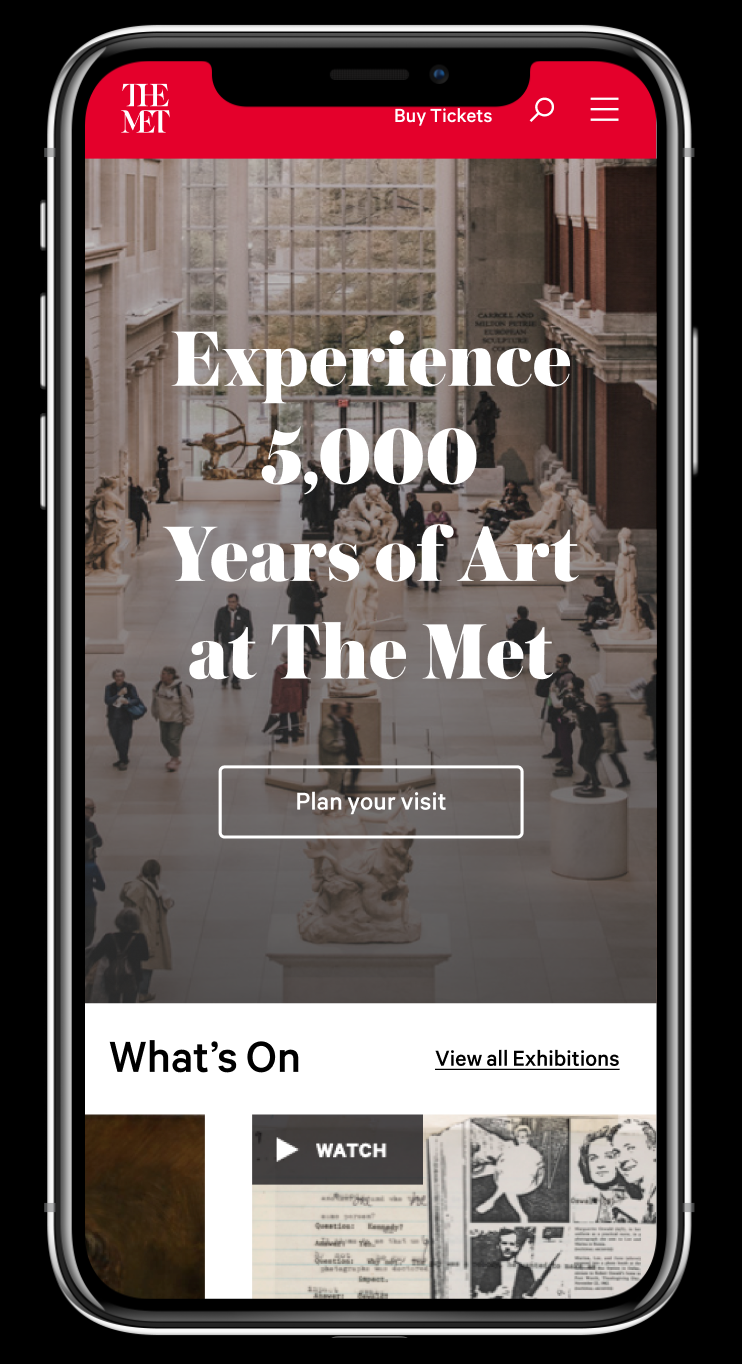
On first load users are presented with no interruption
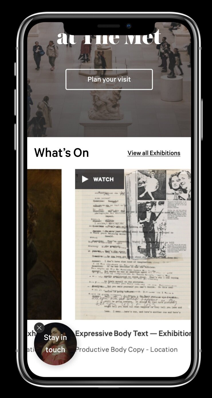
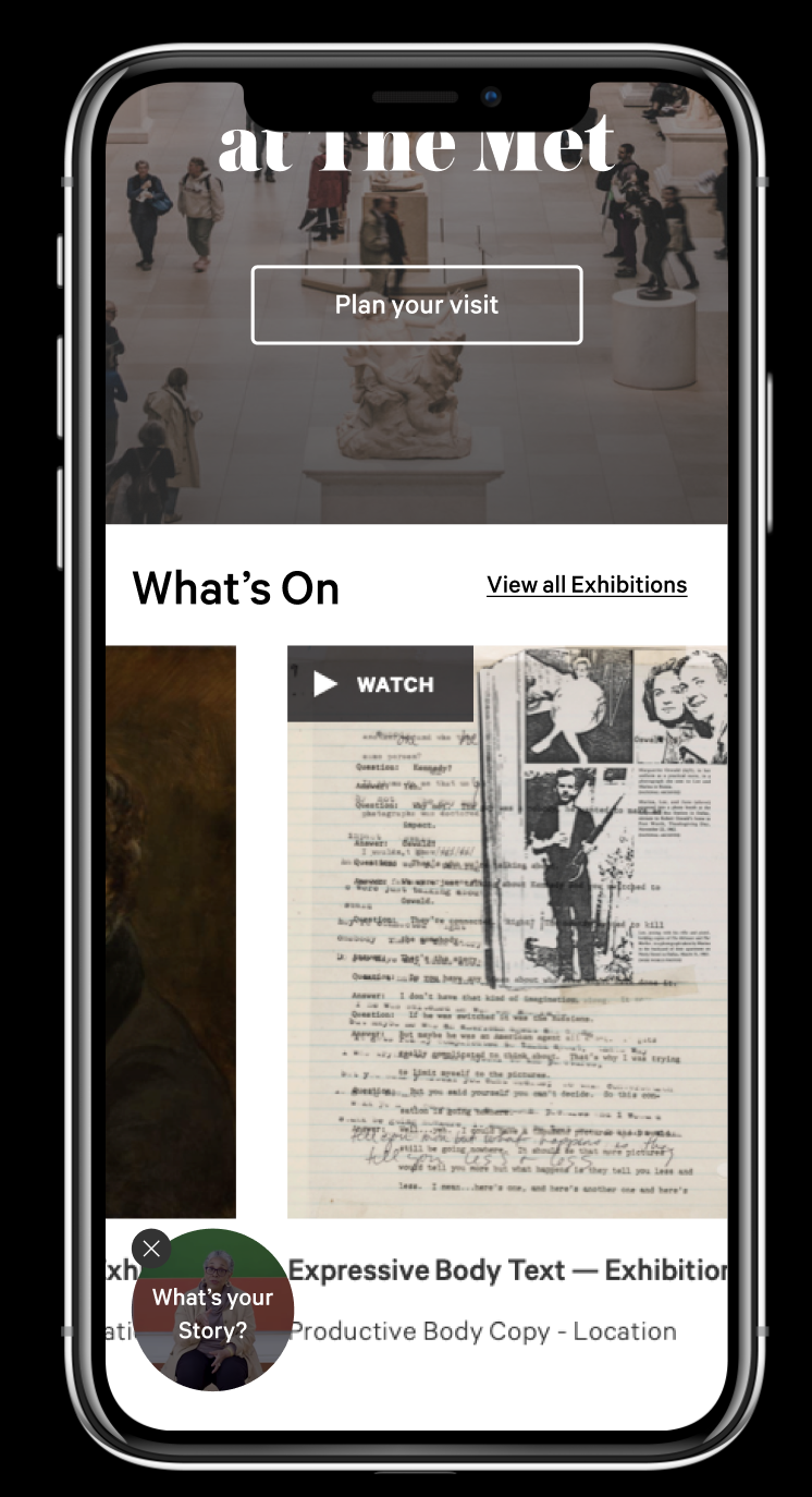
As they scroll through, the helper appears - without interrupting and asks them to engage.
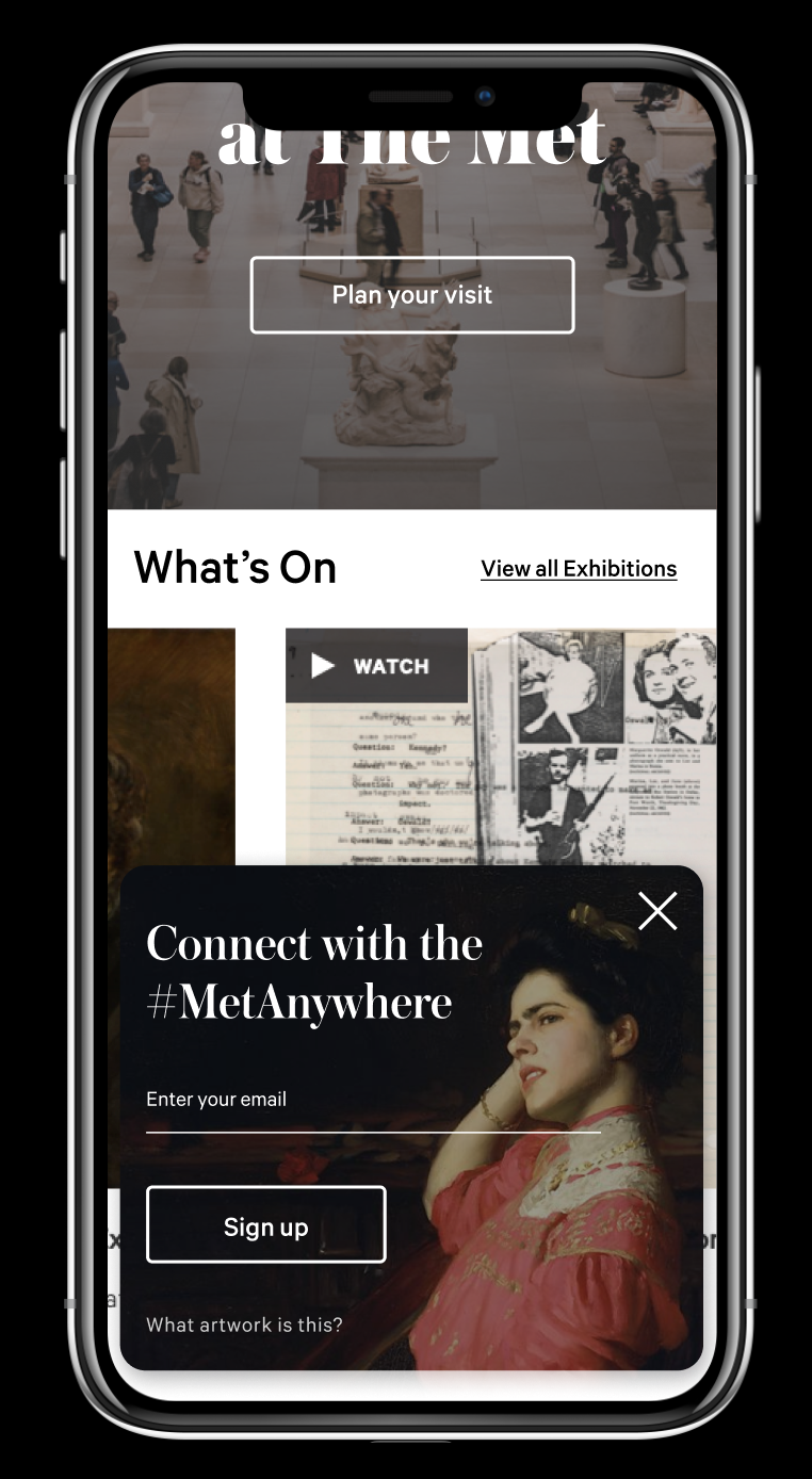
If they choose to engage, the helper expands and users can choose to engage or dismiss.
We also a/b tested for type of content.
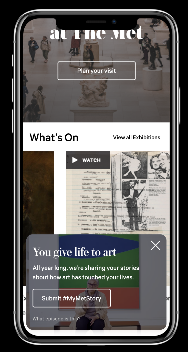
Here users can engage with other media.
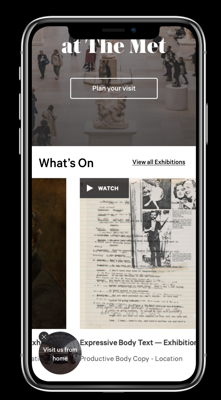
Here users can engage with our most popular feature, online tours.
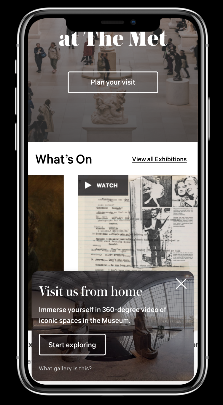
As content differs, experience remains the same.
The helper
As an example for creating a thoughtful interruptor experience, we created 'the helper' a pattern that appears slowly as users begin to scroll in an experience and asks them to engage at their pace.
A/B testing against current pop up experience
Our first approach was to test against the current design implementation of marketing interruptors which was designed as a pop up module. We saw an increase in email capture from a more subtle disruptor that doesn't take over the full screen.
We saw +73% in email signups with the helper and an +143% compared with pre-closure.
A/B testing for content
After our initial test, we aimed to increase engagement with additional entry points to the collection. We tested with different types of content based on where users landed on The Met’s website.


